Oh how time is ticking down very quickly... lots to show here though... If your reading the blog from down to up this section will be in the wrong order as confusing as that sounds.
So I discussed the editor with the programmer to see what could be done from the concept I posted earlier.
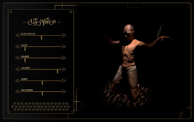
Came up with a draft version which the programmer said would work quite well. I had to ensure that it was possible to get transparency into the engine, although you cant see it here theres a lot of tranparency involved in the UI. At the moment the buttons at the bottom seems to confuse people, it was meant to just be aesthetical but I may need to re-think them. After I got the go ahead from the programmer I did an update on the design:
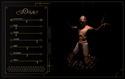
Came up with a nice little logo design which I may use on other products such as the posters and the book which Ill talk more about shortly. Added a Start and Back button to the editor also, even though these buttons won't lead anywhere due to it just being a prototype it always helps to have them there.
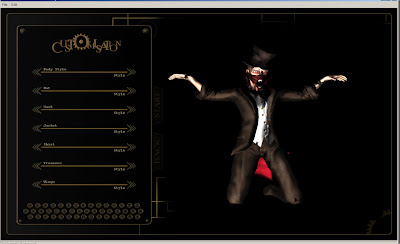
Heres the actual engine running. 360 degree rotation and zoom working. You may notice that the sliders are missing here, thats because discussion with the programmer revealed that it might be more effort than its worth to add the sliders, but we'll see what happens. The lighting is still a strobe type light which Ill want changed as I think it would be better static, might try to persuade the programmer to add 2 lights or ill go down the baked lighting route. Ran some tests on some Uni machines too to make sure this will work at the degree show.
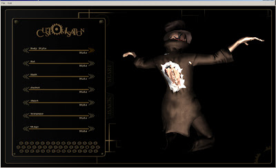
Looks really nice from the back... well see when the UI is linked so we can actually change items. There are a few resolution issues at the moment, if you run this on a 16:10 screen it works perfectly, but if you run it on a 16:9 screen some of the buttons are a bit off. Going to try and make it all run full screen as well, mainly for degree short purposes.

Nice feature where you can view the normals on the model, not for users obviously though!
Set up a DropBox recently as well, which is basically a cloud for storing and sharing files. It was too difficult sending files over hotmail, and was a bit stupid as well because you could only send 10mb files and the while editor is about 200mb... so yea... will post the exciting logs up here to show how were using it.
Note: log changes appear every time someone uses the editor and a couple of other people were invited into the project to just take a look.Had to post DropBox's image too, funny advertising is always the best.

Not the most exciting image in the world, but it shows how we use dropbox. Note it doesn't show when a file has been downloaded to be worked on.
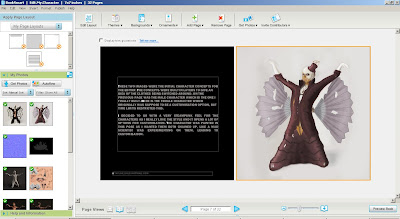
I have been working on my book a lot recently too trying to get it done for professional practice and my degree show. Its going really well so far and will hopefully order it today, really looking forward to seeing it.
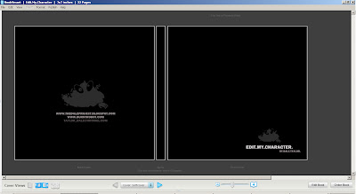
Here is the front and back of the book, nice and simple. just sorted out a website domain called www.burntrobot.com, nothing on the site yet but I began to design the logo which will be used on my book.
 Ok so a lot to write about here. 2 weeks left *scream*. Yea so we finally got the lighting working really well, this is a screenshot from the realtime engine, looking really good so far. Had to mess around with numbers to set the lighting up for specular diffuse and occlusion. To use to fancy maya lighting which lets me just select a colour and brightness! Anyway you can see on this one it has a nice orangey light from the front, to give the lightbulb feel and a second blueish light from the back for this cold dark feel. Works really well contrasting each other, especially at side angles so you can see both lights.
 The programmer managed to link everything up now so users can change clothing and textures etc. Also I uploaded more textures of the different outfits, for example below the nice green suit. Sticking to dull colours though. Tattoos turn on and off now as well.
 Again just an example with the purple clothes. Tilted the camera up slightly also as I wanted the use to be 'looking down' on the character.
 Had a bit of discussion about the buttons at the bottom of the design in the project supervisor meetings and I decided to scrap them and use them in another way. Wasnt feeling the UI to much there yet, was a bit messy and complex so I decided to redesign it slightly. As you can see its a bit more straight to the point, and is even more steampunkish. Will carry on adding extra detail into the background.
 Quickly designed some Business cards and sent off for 200 of them. Pretty pleased with how they turned out. Nice and simple and showing my model well. Having trouble with the website at the moment, the hosting server isn't being cool so trying to get that fixed at the moment, fingers crossed ill have it ready in time.
 Just the reverse side showing low poly.
 The log... a lot to flip through but it just shows more back and forth with the programmer. Is a nice example of how things keep getting re-editted etc. Click and zoom to read properly.


 Also the editor designed in my concept art was a bit complex and wouldn't suit a black background in the first place. So decided to get to work on a new, more simple modern looking one, with inspiration from APB and Mass Effect. Still lots to go into it but it's getting there. The UI will have a level of transparency (lets see what the programmer thinks when he see's it anyway, surely must be more simple to program than the last one I pitched...) and you will be able to see areas of enviroment in the background, pipes, chains, patches of walls etc. Still trying to stick with the steampunk feel aswell to blend the character and editor together, have got to get the balance really right here, and not make it look like some future interface. If you can't tell here the key's are the bottom are like from a tyepwriter, with sciencey symbols on... ooo spooky.


